From Lino
Web Copy: Oxford Comma Co.
Photography: Petra Somers Photography, Shelby Ringer, Camilo Flores
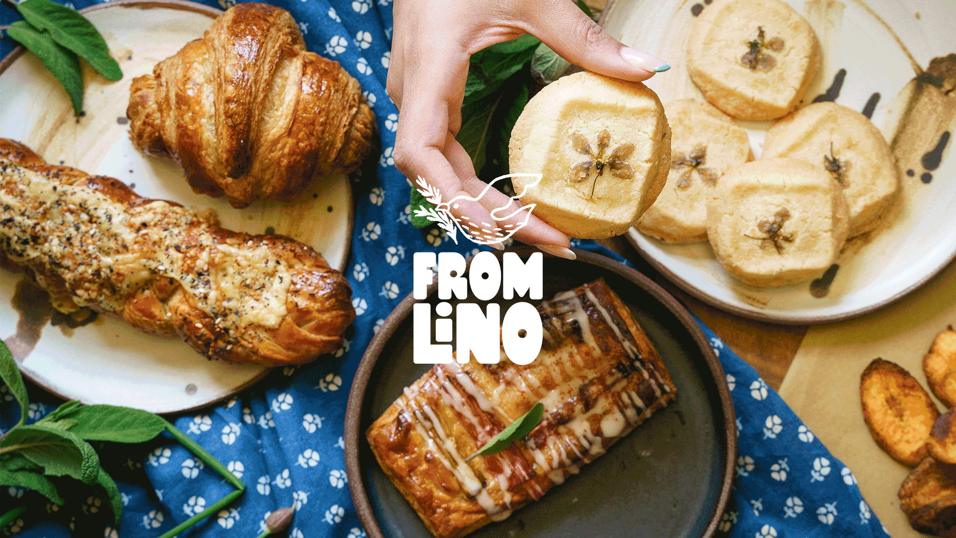
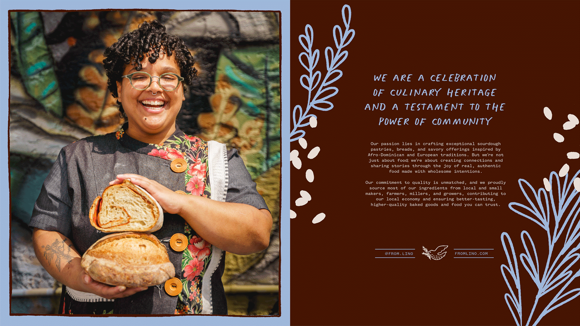
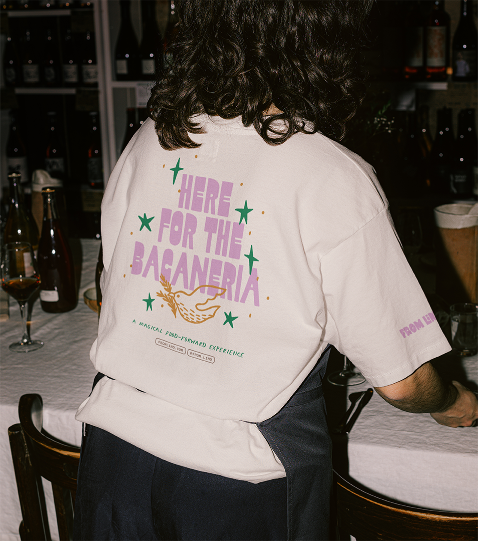
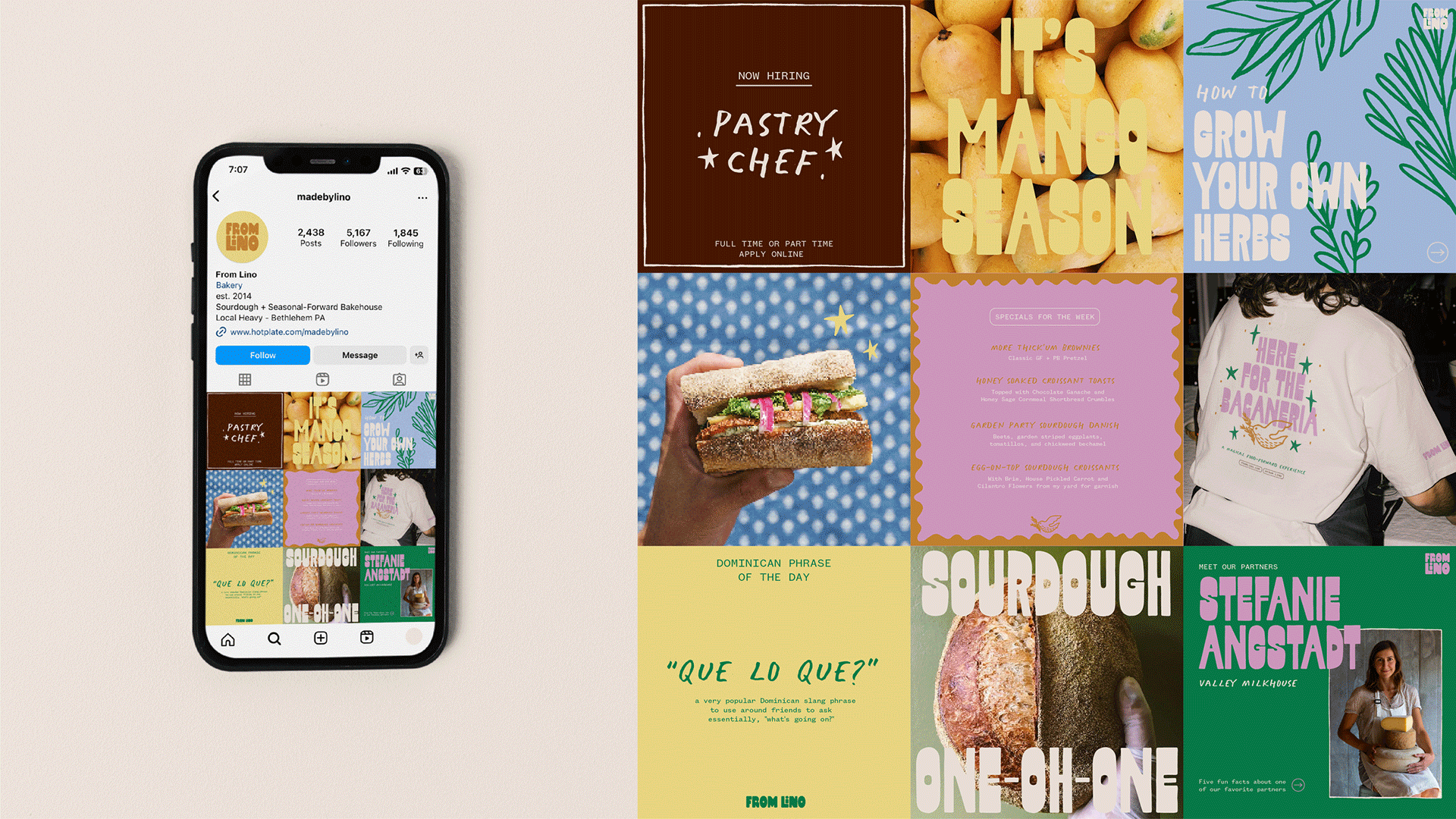
From Lino is a Dominican-inspired bakehouse that’s as much about culture and community as it is about food. As the brand expanded from pop-ups into a physical space, dinner clubs, and educational content, we developed a bold, story-rich identity that reflects founder Melanie Lino’s roots and supports the many ways she shows up in her community.
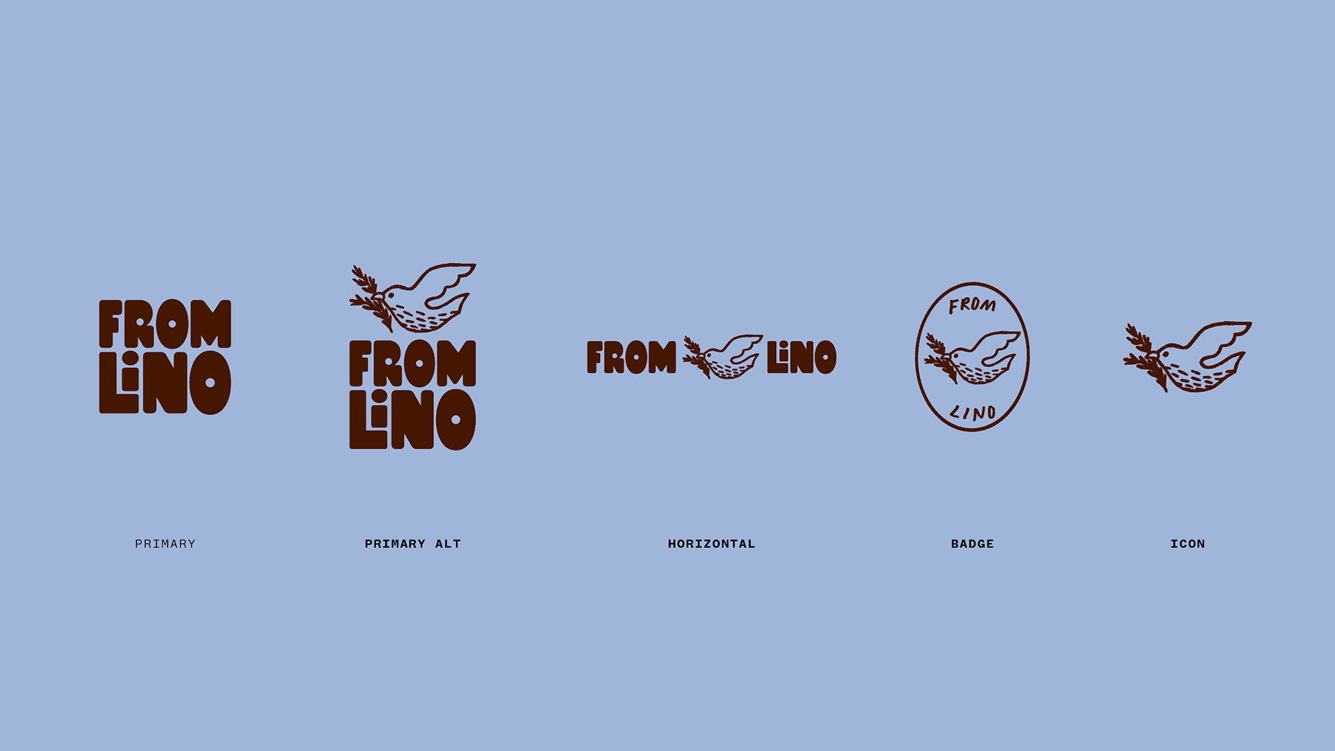
From Lino’s original identity was warm and handmade, but limited in scope. As the brand evolved, it needed a more flexible, cohesive system that still felt personal while supporting expansion across new offerings and experiences. Our challenge was to build an identity that was rooted in Melanie’s culture and values, but dynamic enough to carry the brand into its next chapter.
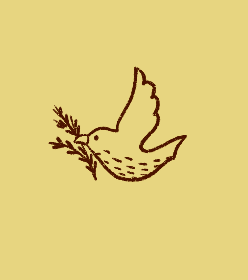
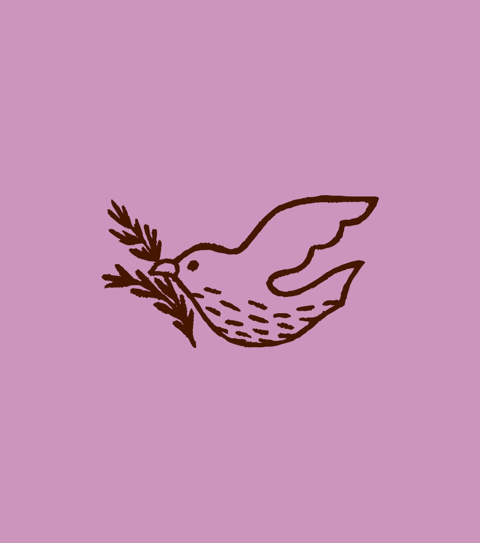
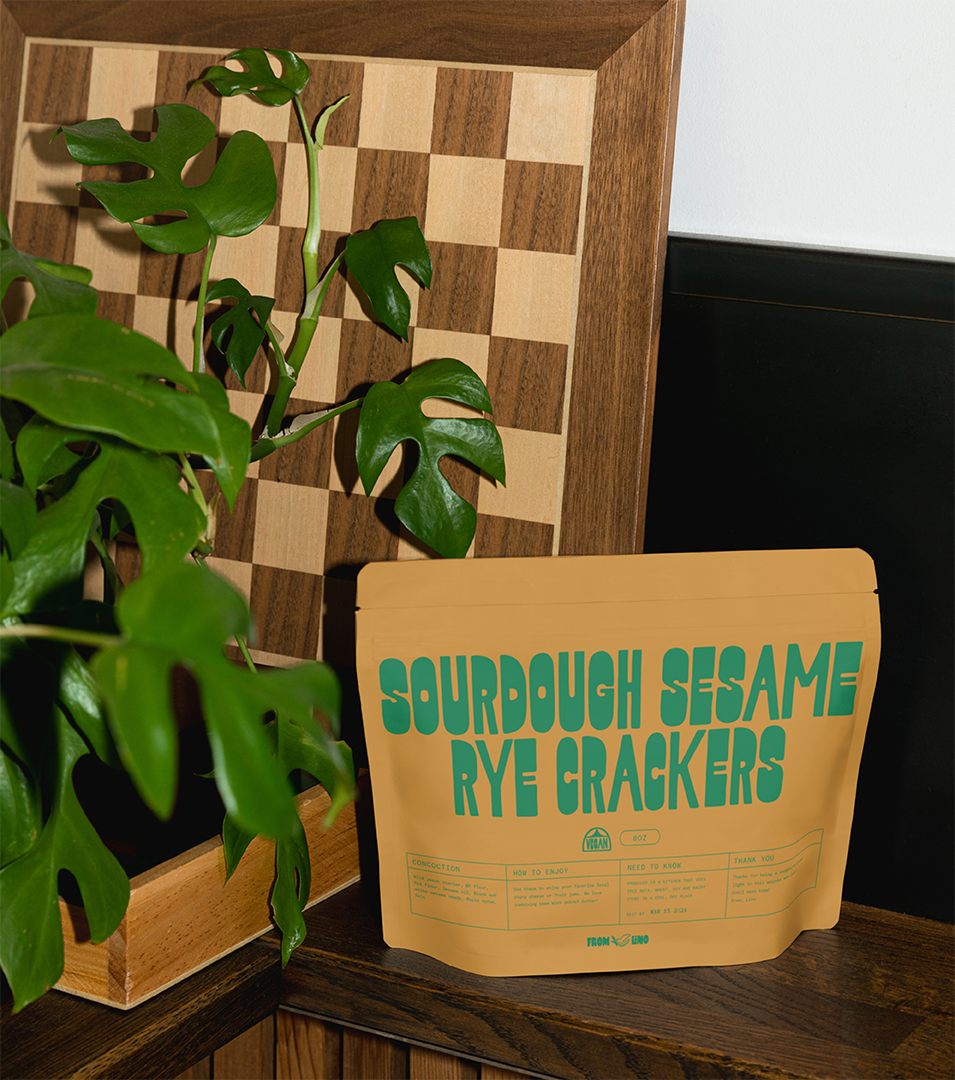
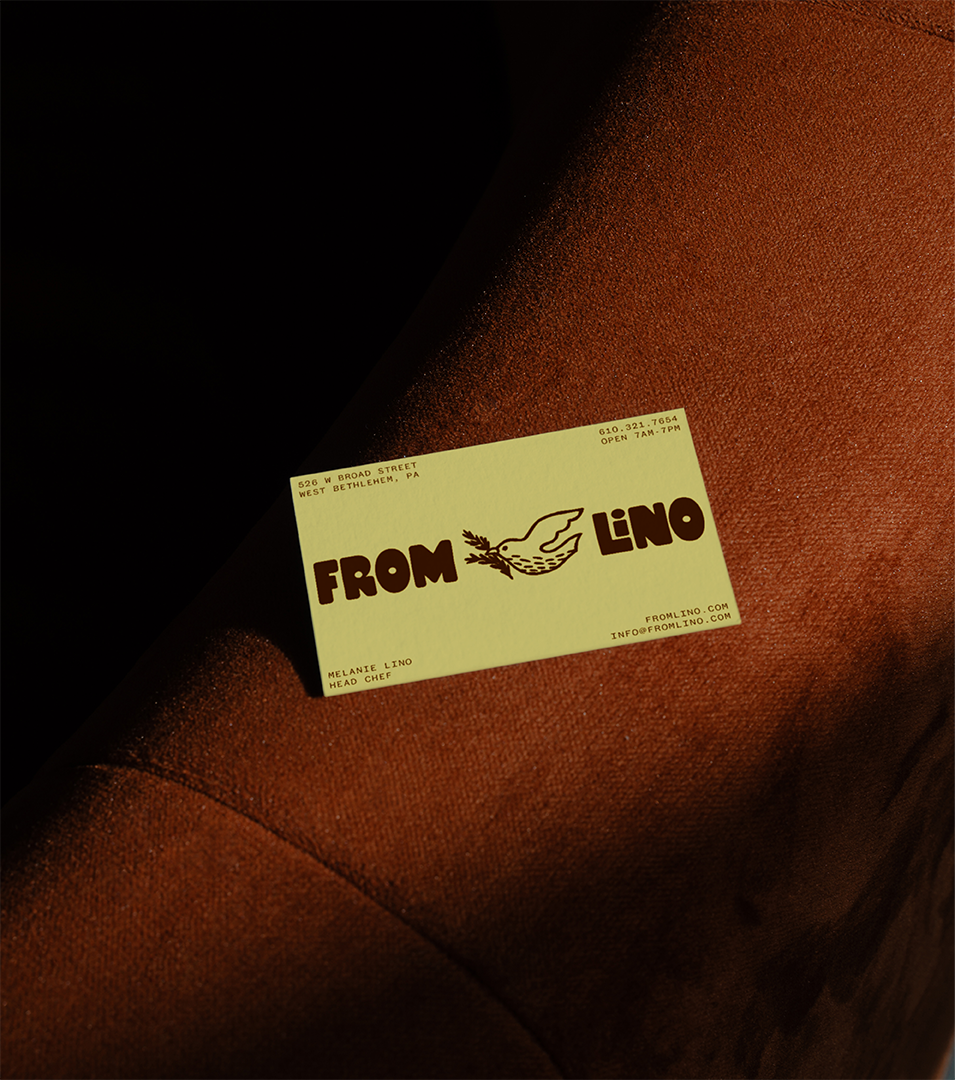
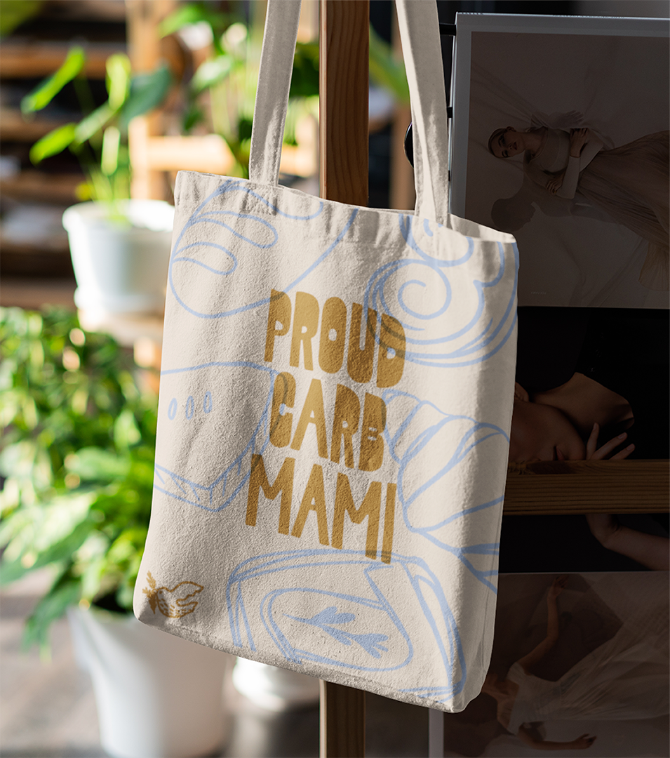
We reimagined the brand with symbolism, storytelling, and adaptability at its core. The logo pairs the Cigua Palmera (native to the Dominican Republic and known for its communal nature) with a rosemary sprig (a “soul herb” for Melanie), to reflect both her cultural heritage and values. A bold type system (including a display font inspired by vintage salsa posters) and colorful brand palette brings energy to the brand. We paired that with loose, oversized illustrations of key herbs and ingredients, anchoring the brand in the food itself. Every element was designed to feel vibrant, welcoming, and unmistakably hers.