Oxford Comma Co.
Brand Voice Development and Web Copy: Oxford Comma Co.
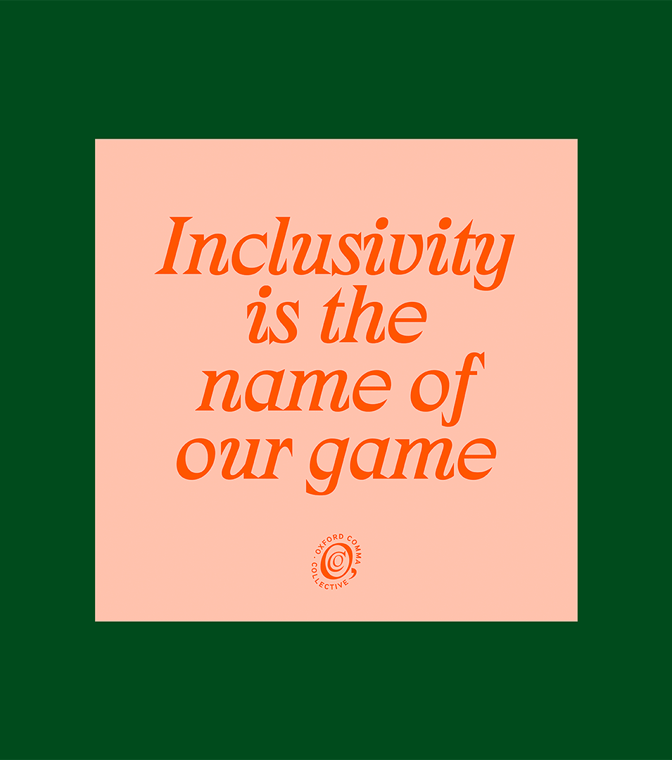
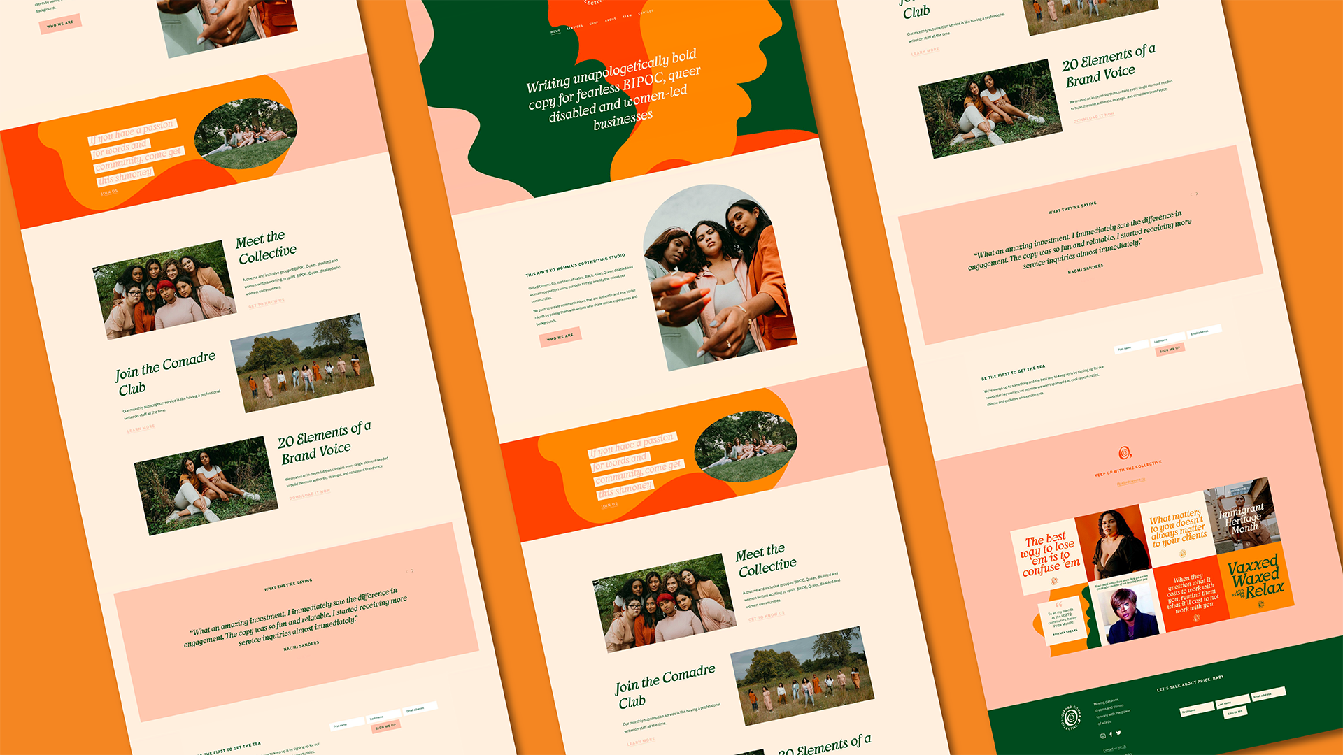
Oxford Comma Co. is a full-service writing studio by and for Black, Indigenous, and Women of Color. With a mission rooted in equity, representation, and creative excellence, they pair clients with writers who share their values and lived experiences. With a strong brand voice already in place, our goal was to develop a bold, intentional visual identity that reflects their perspective and honors the people they serve.
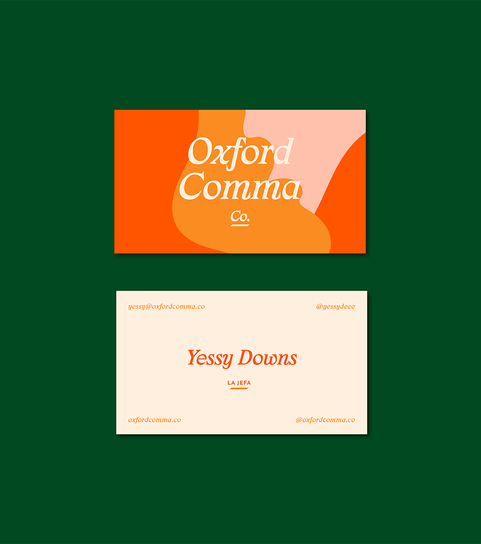
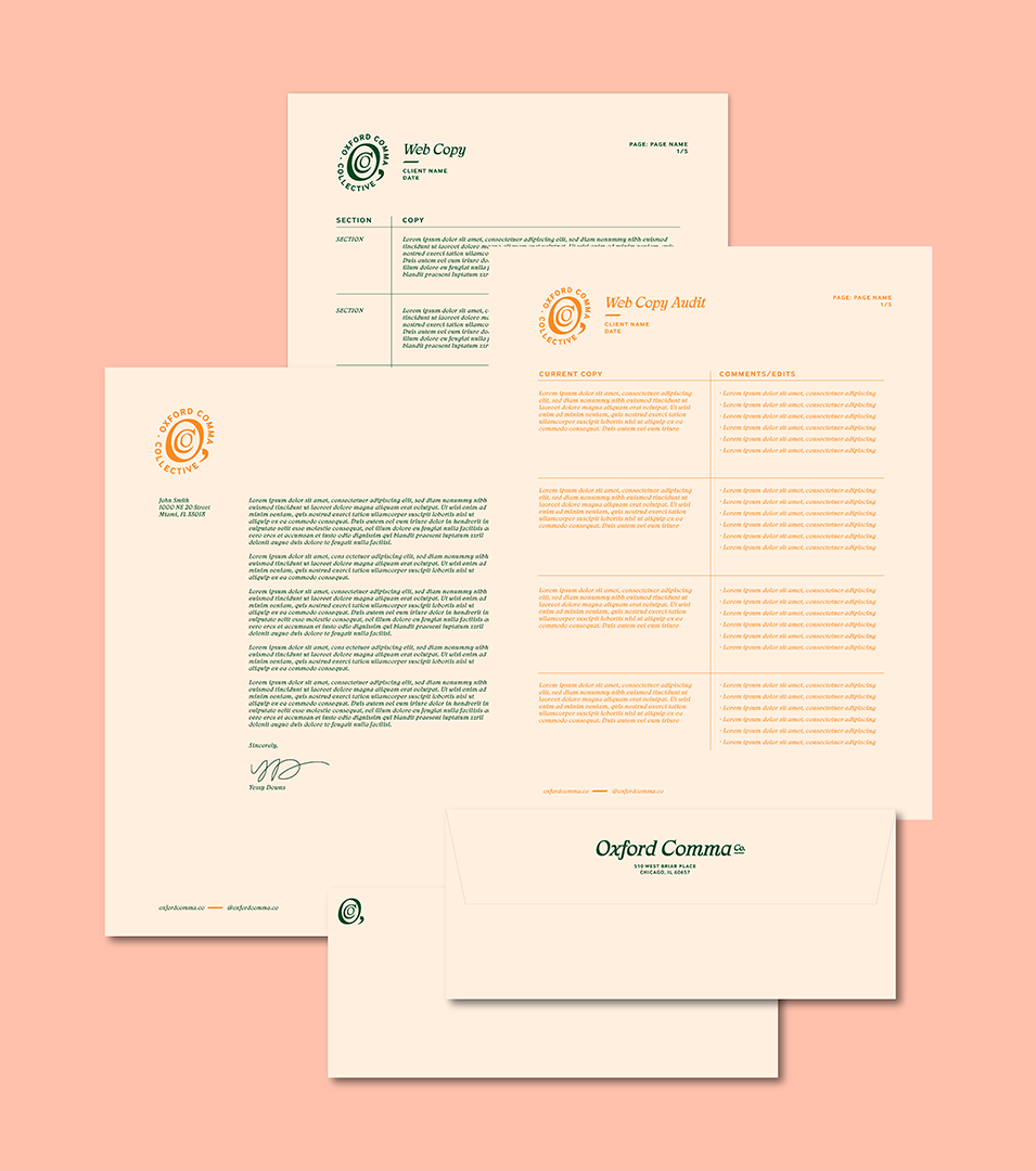
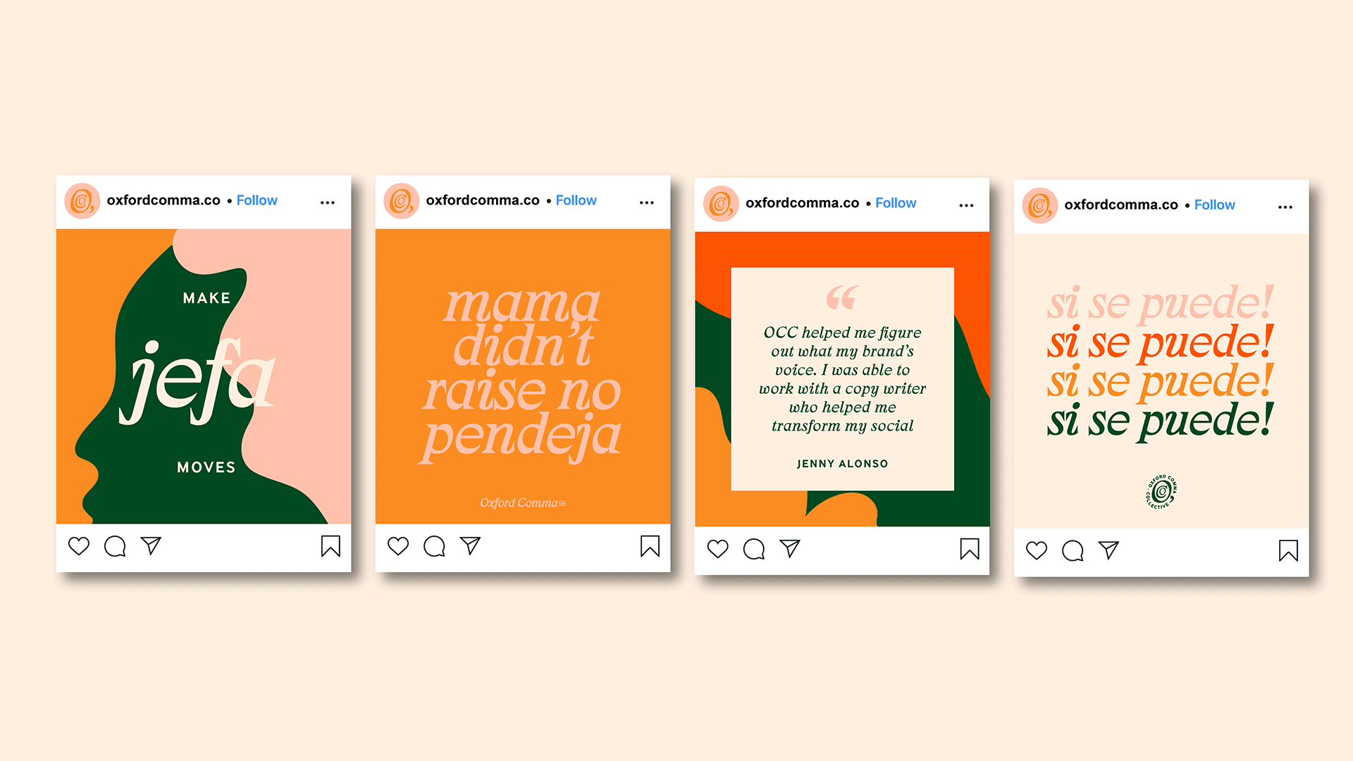
Oxford Comma Co. didn’t need help finding their voice; they needed a visual identity that could stand shoulder to shoulder with it. The challenge was to create a system that felt expansive, powerful, and representative of both who they are and who they support, while translating seamlessly across digital, print, and social formats.
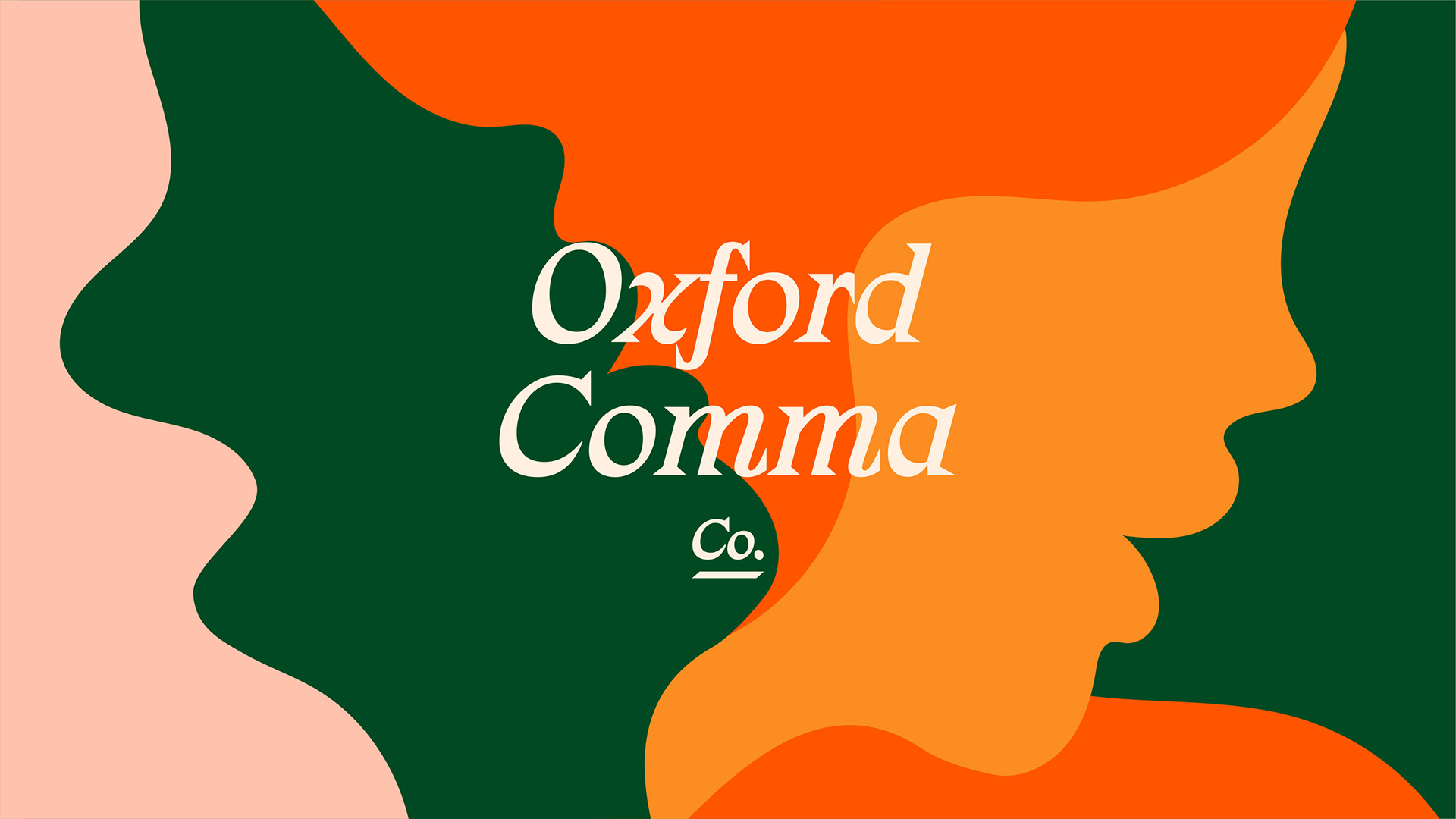
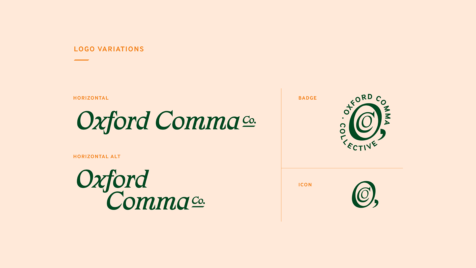
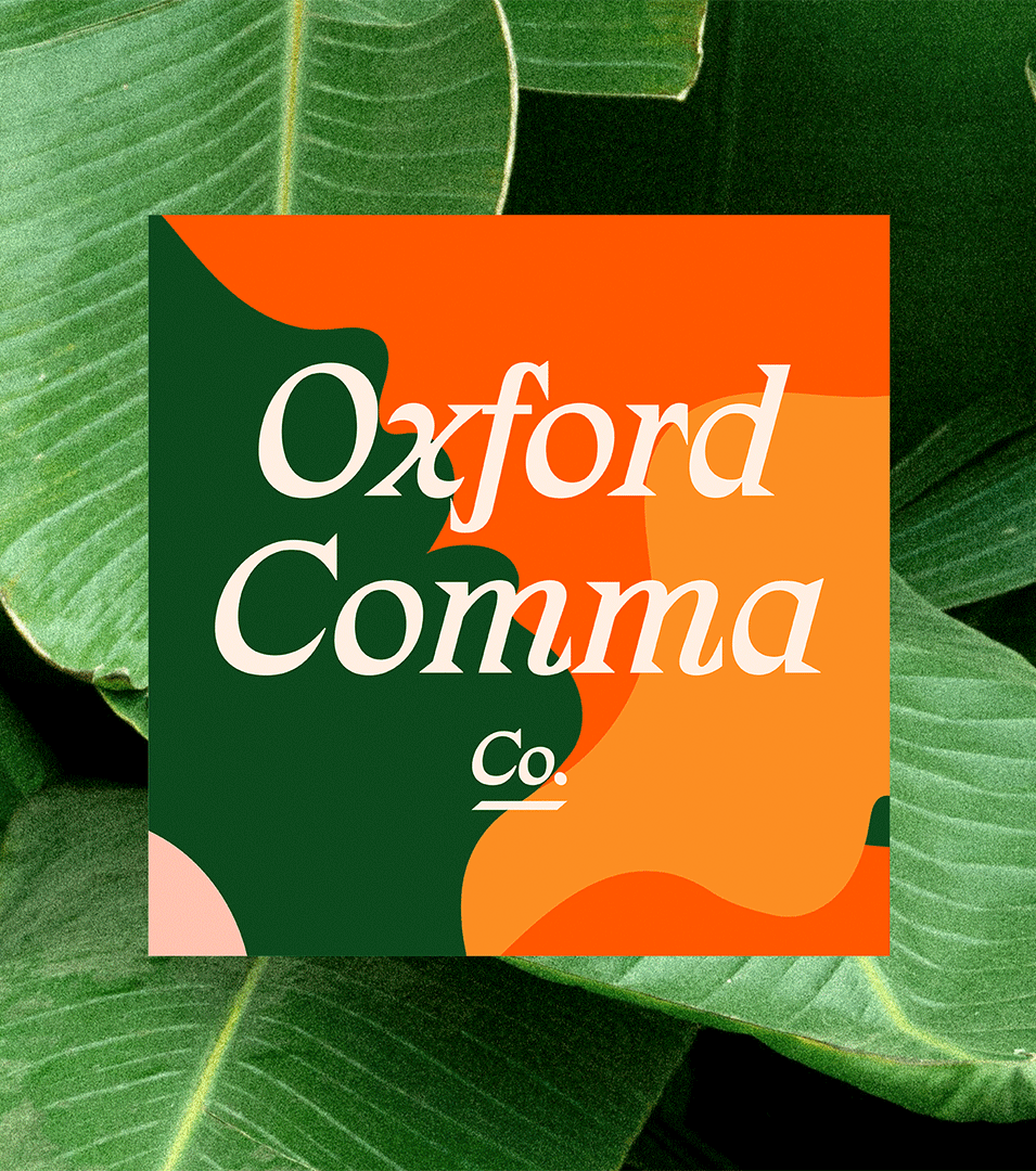
We designed a visual system grounded in bold, abstract silhouettes inspired by women’s forms and used throughout the brand as patterns and graphic motifs. A tropical, feminine palette of warm earth tones draws from natural elements like palm trees, terracotta, and cacti. For typography, we paired a unique, slightly edgy serif (a nod to the studio’s editorial roots) with a clean, modern sans to balance structure and personality. The resulting identity is layered, expressive, and built to champion every voice it represents.